

Last year, we started collecting K12 school board usage data for Learning Management Systems (LMS), Email systems and Student Information Systems (SIS). Unlike LMS and email systems, the SIS used in K12 are completely different from the higher education systems. Very few SIS companies look to have a product that can be used for all levels of student management.
As we had shown in our SIS post on higher education SIS, the systems used can often be broken down by certain characteristics. One of these is the enrollment size of the school districts. If we add a dot on a graph for every school board in our DB and map them out based on the system used and the total enrollment size of the school board, we get the following graph:
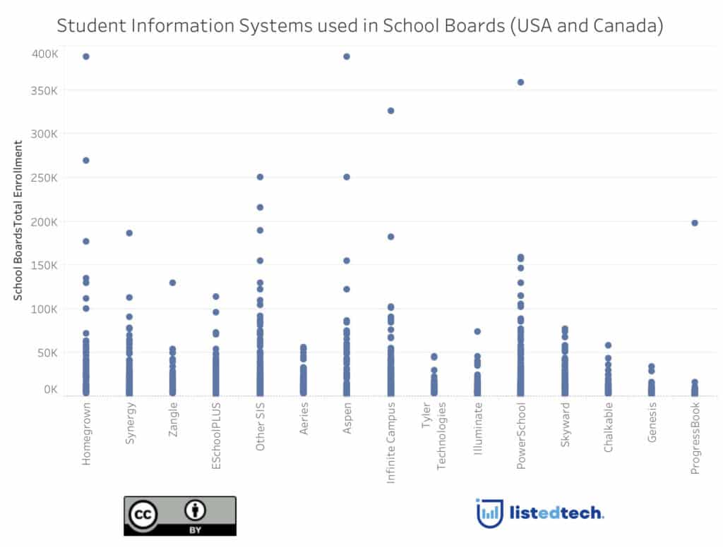
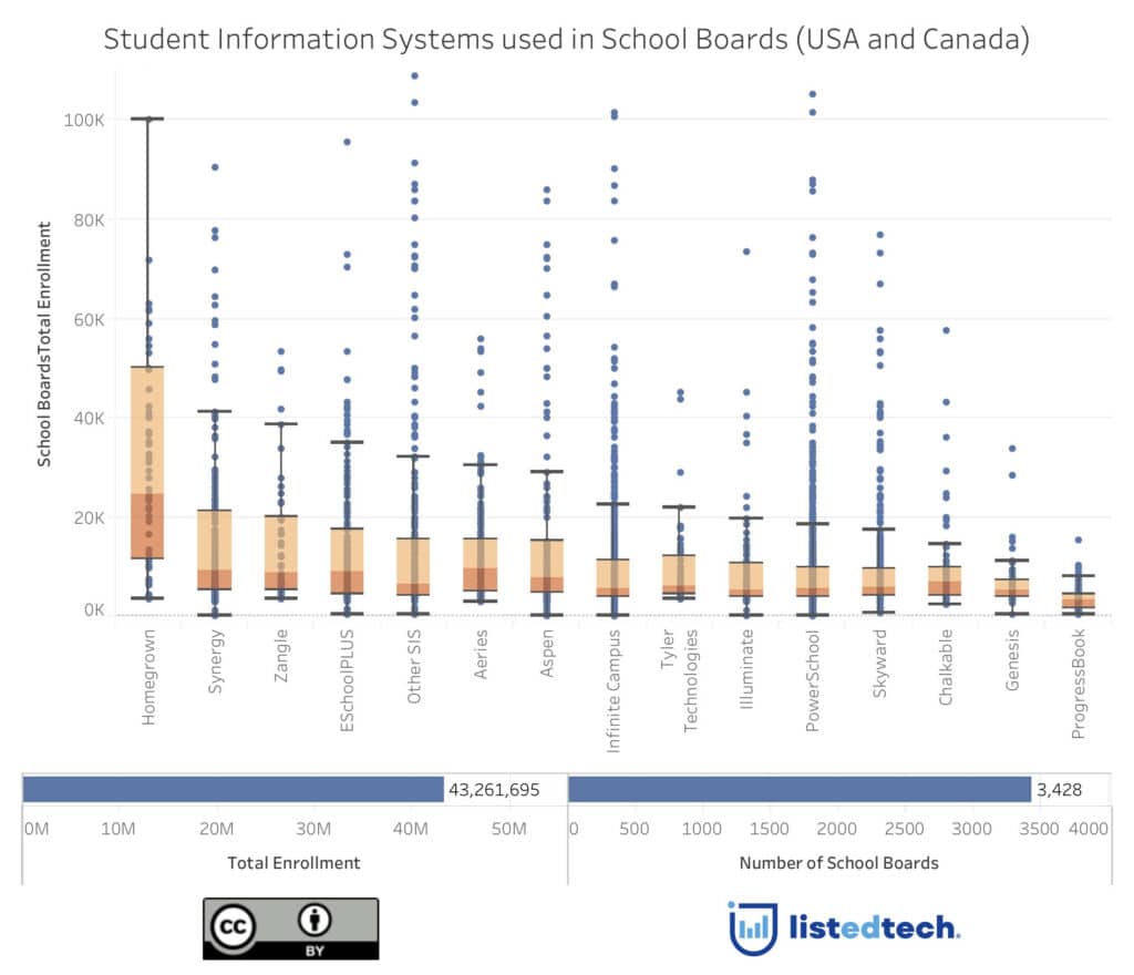
If we add a Box-and-Whisker Plot graph and we lay it on top of this (see explanations below), we can help illustrate how the size of enrollment of the majority of clients is concentrated. Do they have clients that are outside the Box-and-Whisker Plot graphs? Yes, but we call them outliers. A good example of outliers is with PowerSchool.
In order to understand Box-and-Whisker Plot graphs, here are a few explanations.
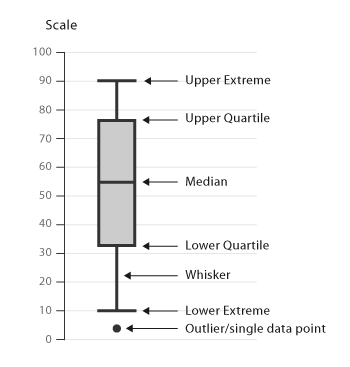
First, you determine the median (value separating the higher half of a data sample from the lower half), then the upper and lower quartiles. Together, these form the “box” which is represented in orange. The upper and lower quartiles are the medians of the upper and lower half of the data set (light and dark orange).
Now the ‘whiskers’ are the minimum and maximum of the “standard” data set, represented by dark black lines in the graph.
Over and below these whiskers are the outliers; the data-points that are considered out of the norm and which are outside the box plot. As you can see, several points are out of the norm and some do go higher. I just cut the top of the graph to make it clearer. If you see lots of lines outside the whiskers (example PowerSchool), it’s because they have a high concentration of institutions between the whiskers.
The data
The data used is from the biggest K12 school boards in Canada and in the United States. I’m making sure that this is understood since we are still in the process of getting the information of the smaller (ie. total enrollment of under 3,000 students) school boards. We don’t have all school board but this data represents over 70% of the estimated 56.6 million students in USA and 5 million in Canada.
We are showing the top 14 systems (top being the most implementations). The others have been grouped in (you guessed it) “Other SIS”.
If you look at the chart below, you will find ‘homegrown’ followed by Synergy on the left with the highest upper quadrant meaning that the product has a high % of large school boards using their system. On the right side of the chart, you find ProgressBook and Genesis with the smaller school boards.
What will happen once we add more school boards?
If we assume that the same 14 products remain, the data will be pulled down; meaning that the upper extreme of the whiskers will not be as high. Another good assumption would be that new players will appear from our group of “Other SIS” to become one of the top systems.
LMS data will be coming out this Spring – watch for updates.